Landing Page Optimization Checklist: The 7 Frictions That Kill Conversions
Clicks are coming in, but the page is not converting. That is one of the most frustrating problems in online marketing because the cause is rarely obvious. Is the traffic poor? Is the offer weak? Is the page confusing? Many teams respond by changing random elements and hoping conversion rate improves.
That usually does not work. Weak landing pages are rarely broken everywhere. More often, a few forms of friction interrupt understanding, confidence, or momentum. The problem is usually not “do more CRO.” It is “find what is stopping action.”
This checklist gives you a practical way to do that. You will learn a 7-friction audit model, how to diagnose each issue on a live page, what a before-and-after audit can look like, and what to fix first on low-traffic versus high-traffic pages.
By the end, you should be able to answer three questions quickly: what is getting in the way, how sure are you, and what should you change first?
Start with friction, not guesswork
What “friction” means in conversion terms
In landing page optimization, friction is anything that makes it harder for a visitor to move from interest to action.
That can happen in several ways. Sometimes the visitor does not understand the offer. Sometimes they understand it but do not trust it. Sometimes they trust it, but the form asks for too much. Sometimes the page simply loads too slowly on mobile and breaks momentum before they can decide.
A simple way to think about friction:
- Clarity: Do I understand this?
- Relevance: Is this what I expected after the click?
- Trust: Do I believe this?
- Effort: Is this easy enough to do now?
- Risk: Could this be a bad decision?
- Distraction: What am I supposed to focus on?
- Speed: Can I use this page without delay or frustration?
If any of those answers feels weak, conversions usually suffer.
Why pages fail even when traffic is decent
A common mistake is assuming that low conversions always mean poor traffic. Sometimes that is true. If the audience is badly targeted, page optimization will not save the campaign.
But many pages fail after the click, even when traffic quality is acceptable. A strong click-through rate paired with weak on-page conversion is often a sign that visitors were interested enough to click, then hit friction once they landed.
For example, imagine a Google ad offering a “Free 15-Minute Roofing Estimate.” The ad gets clicks. But the landing page headline says “Premium Exterior Solutions for Modern Homes,” the CTA says “Explore Options,” and the form asks for eight fields. That is not a traffic problem first. It is a relevance, clarity, and effort problem.
Advertisers using paid traffic platforms or services such as Traffics.io can improve media efficiency, but stronger traffic does not remove post-click friction. If the page blocks action, the campaign still leaks conversions.
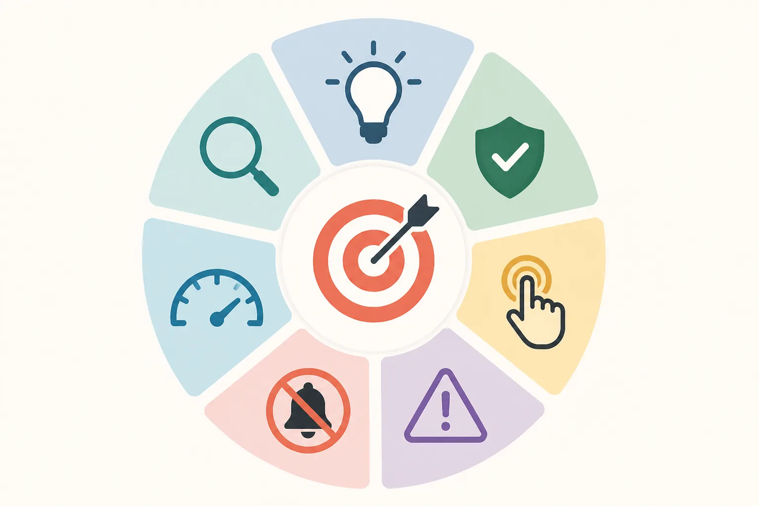
The 7-friction audit model
This article uses seven common sources of conversion friction:
- Clarity friction: the visitor cannot quickly understand the offer, audience, or next step
- Relevance friction: the page does not match the ad, keyword, email, or audience intent
- Trust friction: the page does not provide enough proof or credibility
- Effort friction: taking action feels too difficult or time-consuming
- Risk friction: the visitor fears making a bad choice or committing too early
- Distraction friction: too many competing elements pull attention away from the main action
- Speed friction: the page is slow, unstable, or heavy to use, especially on mobile[^1]
This model turns a vague question — “why is this page not converting?” — into a specific diagnostic system. Instead of making random tweaks, you inspect the page through seven clear lenses.
The 7 frictions that kill conversions
1. Clarity friction
Clarity friction happens when a visitor cannot quickly answer three questions:
- What is this?
- Who is it for?
- What should I do next?
This is one of the most common landing page problems because first impressions happen fast. If the hero section is vague, the visitor has to work to understand the offer, and many will not bother.
A weak example:
- Headline: “Transform Your Business With Better Systems”
- CTA: “Learn More”
A clearer version:
- Headline: “Book a Free 15-Minute Accounting Consultation for Your Small Business”
- CTA: “Book My Free Consultation”
The second version tells the visitor what is being offered, who it is for, and what to do next.
How it works: Clarity reduces cognitive load.
Why it works: Visitors do not want to decode vague marketing language.
When it matters most: Paid traffic, cold audiences, simple lead-gen offers, mobile visits.
Limit: Clear messaging alone will not convert a weak offer or overcome missing trust.
What to do first: Rewrite the headline and CTA in plain language. Use the actual offer and outcome, not abstract brand language.
2. Relevance friction
Relevance friction appears when the landing page does not continue the promise that generated the click.
This is often a message-match problem. If the ad says one thing and the page says another, visitors feel a break in continuity. Even if both messages are technically related, the mismatch creates doubt.
Example:
- Ad: “Get a Free Local SEO Audit for Dental Practices”
- Landing page headline: “Grow Online With Better Marketing Systems”
That headline may be fine in general, but it does not match the visitor’s intent. They expected a page about a free local SEO audit for dental practices.
How it works: Relevance reassures the visitor they landed in the right place.
Why it works: Continuity lowers uncertainty and preserves momentum.
When it matters most: Search ads, segmented campaigns, niche audiences, keyword-driven traffic.
Limit: Perfect message match cannot save a page with high effort or weak trust.
What to do first: Mirror the click source. Match the headline to the ad promise, keyword theme, or email hook. If segments differ meaningfully, create dedicated page versions.
3. Trust friction
Trust friction happens when the visitor understands the offer but does not feel safe enough to act.
This can come from missing testimonials, generic claims, no company details, weak design credibility, or no visible proof of results or process.
Example:
- Claim: “We help businesses grow fast”
- No case studies
- No client logos
- No explanation of what happens after form submission
A stronger version might include:
- “Helped 127 local service businesses increase qualified leads”
- One testimonial with a real name and company
- A short process note: “After you submit, we will review your account and call you within one business day”
How it works: Trust reduces uncertainty between interest and action.
Why it works: Conversion is a bet, and proof makes that bet feel more reasonable.
When it matters most: Higher-consideration offers, financial or health-related services, unfamiliar brands, paid consultations.
Limit: More proof will not fix a confusing page or a mismatched offer.
What to do first: Add proof near decision points, not buried at the bottom. Use specifics instead of adjectives.
4. Effort friction
Effort friction is what happens when the next step requires too much work.
The obvious example is a long form, but effort also includes dense copy, unclear steps, awkward mobile input, confusing scheduling flows, or CTAs that lead into a process the visitor did not expect.
Example:
A page offers a free quote, but the form asks for:
- Full name
- Phone
- Company name
- Revenue
- Number of employees
- Timeline
- Budget
- Long message field
That is a high-effort ask for a low-commitment offer.
A better version might request only:
- Name
- Phone
- One short project question
How it works: Lower effort increases the chance that visitors complete the next step.
Why it works: People avoid unnecessary work, especially while still evaluating.
When it matters most: Mobile traffic, lead forms, first-touch offers, lower-intent visitors.
Limit: Shortening a form too much can reduce lead quality.
What to do first: Remove nonessential fields. If more data is necessary, collect it later or use a multi-step form.
5. Risk friction
Risk friction is different from trust friction, though they overlap.
Trust is about whether the page seems credible. Risk is about what the visitor thinks might go wrong if they proceed.
Examples:
- “Will I get spammed?”
- “Am I committing to a sales call?”
- “What if this costs more than I expect?”
- “What happens after I submit?”
- “Can I cancel?”
- “Is this worth my time?”
A page can look legitimate and still leave those questions unanswered.
Practical risk reducers include:
- “No commitment required”
- “No credit card needed”
- “Takes less than 15 minutes”
- “We will only use your details to contact you about this request”
- “Cancel anytime” or refund language, where relevant
How it works: Risk reduction lowers the perceived downside of action.
Why it works: Many visitors hesitate because they fear consequences, not because they dislike the offer.
When it matters most: Trials, demos, consultations, subscriptions, pricing pages.
Limit: Reassurance language feels weak if trust is poor or the process is still unclear.
What to do first: Address the most obvious objections next to the CTA or form.
6. Distraction friction
Distraction friction happens when the page gives the visitor too many things to look at or click.
This includes:
- Top navigation
- Multiple CTAs with different intents
- Sidebars
- Irrelevant sections
- Excessive animations
- Visual clutter
- Links to unrelated pages
A landing page is not a homepage. Its job is not to offer every possible path. Its job is to support one main decision.
Example:
A lead-gen page has a top nav, three CTAs (“Book a Call,” “Read Case Studies,” “See Pricing”), a popup, and a chatbot that opens automatically. Each element may be useful on its own, but together they split attention.
How it works: Focus improves action.
Why it works: People follow clearer paths when fewer alternatives compete.
When it matters most: Single-offer pages, paid campaigns, mobile screens with limited space.
Limit: Some high-consideration offers need supporting detail, but that is different from offering competing actions.
What to do first: Keep one primary CTA. Remove or reduce nonessential links and visual noise.
7. Speed friction
Speed friction includes both actual load time and perceived heaviness.
A page may technically load, but if the hero image appears late, the layout shifts, the form lags, or the mobile version feels sluggish, conversion momentum drops. Google’s Core Web Vitals guidance reflects this broader user experience issue[^2].
Example:
- Large background video
- Heavy scripts
- Delayed CTA rendering
- Layout jumping after page load
- Slow form submission on mobile
Even small delays can hurt user experience, especially for paid traffic and mobile users[^1].
How it works: Speed preserves momentum and confidence.
Why it works: Delays create frustration and make the page feel less trustworthy.
When it matters most: Mobile traffic, cold paid traffic, form-heavy pages, image-rich layouts.
Limit: A fast page still needs a strong message and offer.
What to do first: Compress large assets, reduce heavy scripts, simplify mobile layouts, and check load behavior in PageSpeed Insights.
How to run a friction audit on a live landing page
A friction audit should be simple enough to repeat and structured enough to improve decisions.
Start with the five-second test
Open the page as if you have never seen it before. Look at the hero section for five seconds, then close it and answer:
- What is being offered?
- Who is it for?
- What outcome is promised?
- What should I do next?
If you cannot answer those clearly, the visitor may not be able to either. This test is especially useful for spotting clarity and relevance friction.
It also helps to ask someone outside the campaign to do the same exercise. Fresh eyes catch vagueness faster than the team that built the page.
Trace the visitor path from click to action
Do not audit the page in isolation. Audit the path.
The basic sequence looks like this:
Click source promise → landing page headline → supporting message → proof → CTA → form or checkout → confirmation
Friction often appears at the transitions.
For example:
- Ad promises a free audit
- Headline talks about growth systems
- CTA says “Learn More”
- Form asks for seven details
- Thank-you page does not explain next steps
That is not one isolated issue. It is broken momentum across the path.
Use a simple scoring system
For each friction, assign:
Severity score (1–5)
- 1 = minor issue
- 3 = noticeable issue
- 5 = severe blocker
Confidence score (1–5)
- 1 = weak evidence or hunch
- 3 = directional evidence
- 5 = strong evidence from behavior or repeated findings
Then note whether the issue affects the main conversion step.
A practical rule:
Fix first when friction is high severity, easy to confirm, and directly affects the main action.
If you want a simple formula:
Priority = severity × confidence × traffic significance
Traffic significance means whether the issue affects a high-volume segment or the core CTA path.
What to review
Most audits should review these elements in order:
| Page element | Main questions |
|---|---|
| Headline | Is the offer clear? Does it match the click source? |
| Subhead | Does it explain who this is for and why it matters? |
| Hero visual | Does it support understanding or create confusion? |
| Primary CTA | Is the action explicit and proportionate to the ask? |
| Form or checkout | Are there unnecessary fields or steps? |
| Proof | Is there believable evidence near the decision point? |
| Layout | Is attention guided toward one action? |
| Mobile version | Is the page usable and readable on small screens? |
| Load behavior | Is anything slow, unstable, or delayed? |
This is where the checklist becomes practical. You are not reviewing aesthetics in general. You are checking whether each element creates or removes friction.
Where to get evidence
Use tools as evidence, not as automatic truth.
Helpful sources include:
- GA4 or similar analytics for bounce patterns, conversions, segment differences, and device splits
- Ad platform reports for click-through rate, audience performance, and keyword-level intent
- Heatmaps and scroll maps from tools like Hotjar, Microsoft Clarity, or Crazy Egg
- Session recordings for hesitation, dead clicks, wandering, and mobile issues
- Form analytics for start rate, completion rate, and field-level drop-off
- Google PageSpeed Insights for speed diagnostics and Core Web Vitals[^1][^2]
- Search Console for query intent if organic search is involved
One caution: heatmaps and recordings are useful directional evidence, but they do not prove causation by themselves. Use them to spot patterns and build better hypotheses.
How to spot each friction in practice
The model becomes useful when you can connect symptoms to likely causes.
Signals of clarity problems
Common signs:
- High bounce or low scroll depth from cold traffic
- Session recordings show hesitation in the hero section
- Users scroll quickly without interacting
- CTA click rate is weak despite decent traffic quality
- The page uses vague or jargon-heavy language
Mini example:
A B2B software page says, “Operational intelligence for modern workflows.” Visitors may not know whether that means analytics, automation, or consulting. Replace it with something concrete like, “Monitor inventory, orders, and supplier delays from one dashboard.”
Signals of relevance problems
Common signs:
- Strong ad CTR but weak landing page conversion rate
- Some keywords or audiences convert much better than others
- Search visitors bounce when the page does not reflect query intent
- Paid social campaigns underperform when one page serves multiple audiences
Mini example:
A campaign targets “email marketing for ecommerce,” but the page is a general agency page. A dedicated ecommerce email services page is likely a better fit.
Signals of trust problems
Common signs:
- Visitors reach the CTA or form area but do not submit
- Visitors spend time around testimonials, pricing, or company details
- On-site questions repeatedly ask, in softer terms, “Are you legit?”
- Claims are broad but unsupported
Mini example:
A page claims “Trusted by hundreds of brands” but shows no logos, names, or examples. Replacing that with three recognizable client logos and one short result-based testimonial makes the claim more believable.
Signals of effort problems
Common signs:
- High CTA clicks but low form completions
- Good form starts but drop-off on later fields
- Strong engagement above the fold, then abandonment at the action step
- Mobile users convert far worse than desktop users
Mini example:
A “Get a Quote” page asks for business revenue and project budget before the first conversation. Removing those fields often reduces friction without hurting lead flow.
Signals of risk problems
Common signs:
- Visitors hesitate near pricing or form areas
- Common objections include spam, contracts, cancellation, or hidden costs
- Demo or trial pages get interest but low completion
- CTA clicks happen, but the final step stalls
Mini example:
A free trial page does not explain whether a credit card is required. A small line under the CTA saying “No credit card required” can remove a meaningful source of hesitation.
Signals of distraction problems
Common signs:
- Many clicks go to non-primary links
- Session recordings show wandering behavior
- Multiple CTAs split attention
- Long pages contain unrelated sections that break momentum
Mini example:
A consultant’s landing page includes navigation to About, Podcast, Blog, Resources, and Contact. For campaign traffic, removing navigation and keeping one clear CTA usually improves focus.
Signals of speed problems
Common signs:
- Mobile bounce rate is much higher than desktop
- The hero section loads slowly
- Buttons shift while loading
- Form fields lag or the page stutters on scroll
- Performance drops on slower networks or older devices
Mini example:
A page uses a large autoplay video in the hero. Replacing it with a compressed static image often improves both speed and clarity.
Before-and-after scenario: applying the audit
The original page
Here is a realistic paid traffic example.
A local accounting firm runs Facebook ads with the promise:
“Free 15-Minute Consultation for Small Business Tax Planning”
The ad gets clicks at a healthy rate, but the landing page converts poorly.
The page headline says:
“Grow With Smarter Financial Systems”
The CTA says:
“Learn More”
The form asks for:
- Name
- Phone
- Business name
- Annual revenue
- Number of employees
- Timeline
- Notes
There is top navigation, no visible testimonial near the form, and a large mobile hero image that loads slowly.
Audit findings
| Friction | Severity | Confidence | Why |
|---|---|---|---|
| Clarity | 5 | 5 | Headline is vague and CTA does not state the next step |
| Relevance | 5 | 5 | Ad promise is a free tax planning consultation; page language does not continue it |
| Trust | 4 | 4 | Little proof near the form and weak process explanation |
| Effort | 4 | 5 | Form asks for too much too early |
| Risk | 3 | 4 | No reassurance about what happens after submission |
| Distraction | 3 | 4 | Navigation creates alternative paths |
| Speed | 3 | 4 | Mobile hero loads slowly and delays the main content |
This is a good example of compounded friction. No single issue fully explains the weak conversion rate. Together, they create a clear post-click problem.
The revised page
The revised version makes five important changes.
1. Match the message to the click
New headline:
“Book a Free 15-Minute Tax Planning Consultation for Your Small Business”
This removes both clarity and relevance friction immediately.
2. Make the CTA explicit
New CTA:
“Book My Free Consultation”
That tells the visitor exactly what happens next.
3. Reduce effort in the form
The form now asks only for:
- Name
- Phone
- One optional question
The team can collect deeper business details later.
4. Add proof and process clarity near the action
Just above the form:
- One testimonial from a local business owner
- A line explaining: “After you submit, we will contact you within one business day to schedule your call.”
This addresses trust and risk.
5. Remove distractions and improve mobile speed
Top navigation is removed.
The hero image is compressed and simplified for mobile.
The CTA appears earlier on small screens.
Which changes usually move results first
On pages like this, the changes that usually move performance first are:
- Message match
- Offer clarity
- CTA specificity
- Form simplification
- Trust near the CTA
Cosmetic changes like button styling, spacing refinements, or decorative graphics can matter later, but they are rarely the first fix when a page is badly underperforming.
What to fix first: low traffic vs. high traffic
Many teams go wrong here because they treat all pages the same.
If traffic is low
Low-traffic pages often do not produce enough volume for clean A/B tests in a reasonable time. In that situation, waiting for statistical certainty can slow learning too much.
A better approach is to fix obvious blockers directly.
Good no-test fixes for low-traffic pages:
- Rewrite a vague headline
- Match the ad promise more clearly
- Replace “Learn More” with a specific CTA
- Remove unnecessary fields
- Add one strong testimonial near the form
- Remove navigation
- Fix broken mobile spacing
- Compress slow assets
The tradeoff is that you learn less precisely which change caused the lift. But if the problems are obvious, that is often acceptable.
If traffic is high
High-traffic pages have a different advantage: they support cleaner testing.
Instead of changing everything at once, isolate one major variable where possible:
- Headline framing
- CTA wording
- Proof placement
- Form length
- Offer framing
- Above-the-fold layout
This matters because high traffic lets you learn not just whether the page improved, but why.
Quick wins vs. structural fixes
Not every optimization is the same kind of work.
Quick wins remove obvious blockers fast.
Examples:
- Improve headline specificity
- Shorten the form
- Remove extra links
- Improve CTA wording
- Add one concrete testimonial
- Fix mobile spacing
- Compress oversized images
Structural fixes address deeper issues in positioning or page architecture.
Examples:
- Rebuild the page around the correct audience intent
- Create separate pages for different traffic segments
- Repackage the offer
- Change the proof hierarchy across the page
- Redesign the funnel path from ad to page to thank-you step
Quick wins are not shallow. They are simply easier to implement. Structural fixes matter when the page has a deeper relevance or offer problem.
A simple order of operations
If a page has multiple problems, use this order:
- Message match
- Offer clarity
- CTA path
- Trust and risk reduction
- Polish and visual refinement
Why this order works:
- If the click promise and page do not align, the rest matters less.
- If the offer is unclear, proof will not rescue it.
- If the CTA path feels unclear or difficult, visitors stall before acting.
- Trust supports action once understanding is in place.
- Polish helps after the fundamentals work.
This is usually more reliable than starting with layout tweaks or design experiments.
Landing page test ideas by friction type
Not all changes belong in formal tests, but many do once the basics are in place.
Tests for clarity and relevance
Try:
- A headline that mirrors the ad language versus a broader brand headline
- Problem-led versus outcome-led headlines
- Naming the audience directly in the hero section
- Dedicated variants by keyword, audience, or use case
- Rewriting vague CTA text into a concrete action
Example:
“Grow faster with better systems” versus “Get a Free Ecommerce Email Audit”
Tests for trust and risk reduction
Try:
- Moving testimonials closer to the CTA
- Testing number-based proof against general claims
- Adding client logos or certifications
- Clarifying privacy expectations under the form
- Testing reassurance language such as “No obligation” or “No credit card required”
- Explaining what happens immediately after submission
Example:
Adding “We’ll review your request and reply within one business day” below the CTA can reduce uncertainty.
Tests for effort and form simplification
Try:
- Short form versus longer qualification form
- Single-step versus multi-step form
- Removing one or two high-friction fields
- Testing autofill-friendly inputs on mobile
- Clarifying step count in booking or checkout flows
- Changing CTA copy from generic to action-specific
Example:
“Submit” versus “Book My Free Demo” is not just wording. It changes how concrete the next step feels.
Tests for distraction and page focus
Try:
- Removing top navigation
- Reducing secondary CTAs
- Simplifying visual hierarchy
- Collapsing nonessential sections
- Shortening overlong pages for mobile traffic
- Using one dominant button style for the primary action
Example:
A page with “Book,” “Watch,” and “Download” CTAs may perform better when narrowed to one primary path.
Tests for speed and mobile responsiveness
Try:
- Compressing hero images
- Deferring nonessential scripts
- Removing autoplay video
- Testing a lighter mobile layout
- Reducing animation
- Shortening page length for mobile-first campaigns
Use PageSpeed Insights and live mobile checks, not desktop assumptions alone[^1].
Common optimization mistakes that make friction worse
Changing too many things at once
If traffic is high enough to test properly, changing five major elements at once destroys learning quality. You may improve the page, but you will not know which change mattered.
The main exception is low-traffic pages with obvious blockers. There, bundled fixes are often reasonable.
Testing low-impact details before fixing message problems
Button color tests are rarely the first move when the headline is vague, the form is too long, or the page does not match the ad.
This is one reason many optimization programs stall. They test easy things instead of important ones.
Copying best practices without checking intent
A long landing page can work well for complex offers. A short page can work well for simple lead capture. Neither is universally right.
The real question is whether the page fits the visitor’s intent, awareness level, and decision complexity.
Ignoring mobile experience
Many teams review pages mostly on desktop even when campaign traffic is mostly mobile.
That creates blind spots. Small text, awkward forms, delayed buttons, oversized visuals, and cramped layouts often hurt mobile conversion long before anyone notices.
Adding more when the page needs less
When conversion is low, teams sometimes add more sections, more graphics, more motion, and more copy.
Often the page needs the opposite: fewer choices, clearer language, tighter proof, and a simpler path.
A practical checklist you can use today
If you want a checklist that is actually useful, it should help you diagnose friction, not just remind you to “improve UX.”
Use this review once a week for active campaigns.
The 7-friction review checklist
Clarity
- Can a new visitor explain the offer in one sentence?
- Is it obvious who the page is for?
- Is the outcome specific rather than vague?
- Does the CTA clearly describe the next step?
- Can someone understand the hero section within five seconds?
Relevance
- Does the headline reflect the promise made in the ad, keyword, email, or link?
- Does the page fit the audience segment that clicked?
- Does the hero continue the visitor’s intent rather than switching topics?
- Are there dedicated variants for meaningfully different traffic sources?
Trust
- Is there visible proof near the CTA or form?
- Are claims specific and believable?
- Are testimonials identifiable and relevant?
- Is the company clearly presented?
- Does the page explain enough to feel legitimate?
Effort
- Are only essential fields required?
- Is the next step easy to understand?
- Is the CTA ask proportionate to the offer?
- Is the page easy to complete on mobile?
- Are there unnecessary steps, fields, or reading burdens?
Risk
- Does the page address obvious objections?
- Is it clear what happens after submission?
- Does the visitor know whether there is commitment, cost, or follow-up?
- Is there reassurance about privacy, cancellation, refunds, or no-obligation terms where relevant?
Distraction
- Is there one primary CTA?
- Are nonessential links removed?
- Does the layout guide attention clearly?
- Are secondary sections supporting the decision instead of competing with it?
- Is anything visually noisy without helping conversion?
Speed
- Does the page load quickly on mobile?
- Are major images compressed?
- Do layout shifts or delayed elements interrupt the experience?
- Do forms and buttons respond quickly?
- Have you checked the page in PageSpeed Insights recently?[^1]
A weekly audit workflow
A simple weekly process:
- Review campaign performance by source, audience, device, and page
- Check whether CTR is healthy but conversion is weak
- Run the five-second clarity test on the current page
- Review session recordings, scroll behavior, and form drop-off
- Score the 7 frictions by severity and confidence
- Choose one to three priority actions
- Separate them into:
- no-test fixes
- observational follow-up
- formal tests
This is usually enough to keep the checklist actionable instead of theoretical.
When to re-audit
Re-audit the page when any of these happen:
- You launch a new traffic source
- You change ad creative or keyword targeting
- You change the offer
- You add or remove form fields
- Mobile design changes
- Page speed worsens
- Conversion rate drops without a clear explanation
- A segment starts underperforming relative to the rest
Friction is not static. A page that converted well last month can become less relevant after a campaign or audience shift.
Conclusion
Most landing page conversion problems become easier once you stop treating them as vague CRO issues and start treating them as friction problems.
That shift matters because it gives you a better decision process. Instead of changing random elements, you can ask: is the visitor blocked by confusion, mismatch, doubt, effort, risk, distraction, or speed?
The 7-friction model is useful because it matches how real visitors behave. They need to understand the offer, feel it fits their intent, trust it enough to proceed, complete the action without too much effort, avoid unnecessary risk, stay focused, and use the page without delay.
If you remember one thing from this checklist, make it this: optimize in the right order. Fix message match first, then clarify the offer, simplify the CTA path, strengthen trust, and only then worry about polish.
That is how you improve conversions without guessing.
FAQ
Why is my landing page not converting even if my ads are getting clicks?
A healthy click-through rate with weak conversion often means the problem starts after the click. Common causes include message mismatch, unclear offers, weak trust signals, too much effort in the form or checkout, perceived risk, distracting elements, or slow mobile performance.
What does friction mean in landing page optimization?
Friction is anything on the page that makes it harder for a visitor to understand the offer, trust it, or take the next step. In practice, it often shows up as confusion, hesitation, extra work, competing choices, or delays.
What are the 7 frictions that hurt conversions?
The seven frictions are clarity, relevance, trust, effort, risk, distraction, and speed. Together, they explain most post-click conversion problems on lead-gen and sales pages.
How do I audit a landing page for conversion problems?
Start with a five-second first-impression check, then trace the visitor path from click to action. Review the headline, subhead, CTA, form, proof, layout, mobile experience, and load behavior. Score each friction by severity and confidence, then fix the highest-impact blockers first.
What should I fix first on a low-traffic landing page?
On low-traffic pages, fix obvious blockers before running formal A/B tests. Start with message match, offer clarity, CTA path, major form friction, missing trust elements, distracting navigation, and mobile speed problems.
How should optimization change when a page has high traffic?
High-traffic pages allow for more structured testing. Instead of bundling many edits together, isolate major variables such as headline, CTA wording, proof placement, form length, or offer framing so you can learn what caused the lift.
What signals point to clarity friction?
Clarity friction often appears when visitors bounce early, scroll without engaging, or hesitate in the hero section. A vague headline, jargon-heavy copy, or a weak CTA like “Learn More” can make the offer hard to understand quickly.
How can I tell whether the issue is traffic quality or the landing page?
Check where the drop happens. If ad CTR is decent but conversions are weak, the page likely has relevance, clarity, trust, effort, or risk problems. If almost no visitors are qualified or campaign segments underperform across the board, traffic quality may be the bigger issue.
Do all landing page changes need A/B testing?
No. Some problems are obvious enough to fix directly, such as broken mobile layouts, unnecessary form fields, unreadable CTA buttons, slow-loading assets, or irrelevant navigation. A/B testing is most useful when you are comparing strong alternatives and have enough traffic to reach meaningful conclusions.
What belongs in a practical landing page optimization checklist?
A useful checklist should cover whether the offer is clear, whether the page matches the traffic source, whether proof is visible near the CTA, whether the action feels easy, whether risk is addressed, whether the page has one clear path, and whether mobile speed and usability are strong.