Most pricing pages look helpful. They list plans, compare features, and signal transparency. Then they quietly underperform.
Usually, the problem is not missing information. It is mis-timed information. A buyer on a pricing page is not trying to study your packaging model. They are trying to answer a simpler question: Which option fits me, and can I trust this choice?
That is where many pricing pages go wrong. They are built for comparison, not commitment.
Pricing pages underperform when they optimize for comparison instead of commitment
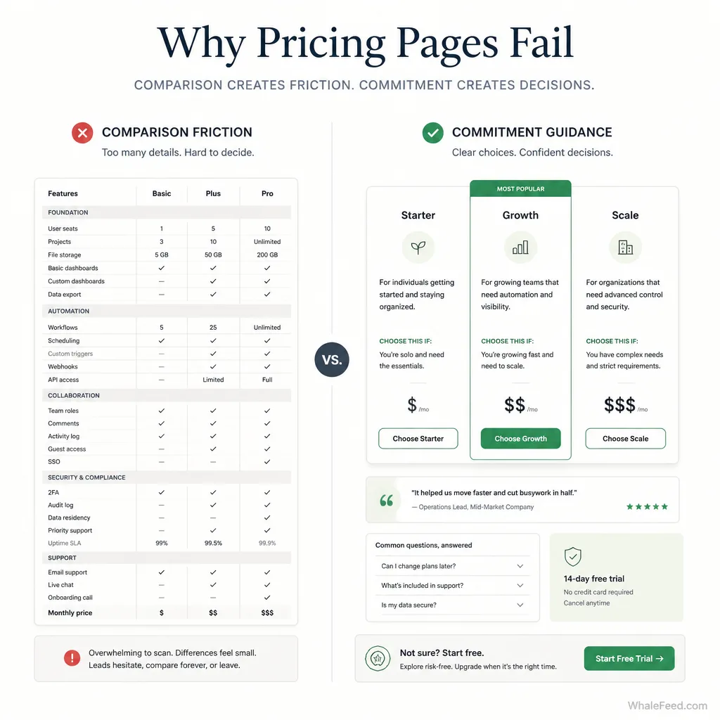
Why feature grids often create analysis instead of action
Comparison helps up to a point. Buyers do need to see differences. But many pricing pages push too far and turn the page into a spreadsheet with a CTA.
CXL’s guidance on pricing pages consistently favors simplicity: help users choose a plan, limit choice, and address objections directly.[^1] That points to an important distinction. Comparison helps only when it shortens the path to a decision. Once it adds reading, sorting, or uncertainty, it starts hurting conversion.[^1]
Baymard’s UX research, though ecommerce-focused, points to the same underlying issue. When price presentation makes users work harder, they miss value or abandon options that may have suited them.[^2] The lesson carries over well: if your pricing layout forces buyers to calculate, decode, or infer too much, conversion usually suffers.
The real job of a pricing page
A pricing page is a decision environment.
Its job is not to display everything. Its job is to make the next step feel obvious and safe.
That means it should answer three questions quickly:
- What each plan is for
- Why one option fits better than another
- What happens after the buyer clicks
The core idea
A buyer rarely converts because they saw one more feature row.
They convert because the page gave them enough confidence to stop searching.
What to show on a pricing page that converts
Lead with buyer outcomes, not internal packaging logic
Weak pricing copy is usually written from the company’s perspective.
Weak example:
- Pro: 25 automations, 10 seats, advanced reporting
Better:
- Growth: For teams replacing spreadsheets and running shared workflows across sales and ops
The second version does more than describe the plan. It defines the buyer’s situation. That matters because buyers think in terms of problems, team context, and outcomes, not your internal feature packaging.
Use “choose this if” blocks to turn plan cards into decision aids
This is one of the simplest upgrades you can make.
A short “choose this if” line helps the buyer map a plan to a real situation.
Examples:
- SaaS: Choose Growth if you need shared workflows across a 5–20 person team and want onboarding help during setup.
- Course: Choose Cohort if you want feedback, deadlines, and live support instead of self-paced access alone.
- Service: Choose Sprint if you need a landing page written in 7 days with fixed scope and fast approvals.
This kind of copy reduces interpretation. It also makes “most popular” labels less hollow.
Show the differences that actually affect the decision
Not every plan difference belongs in the main view.
Show the differences that change the purchase decision:
- usage limits
- seats or access level
- support level
- implementation help
- delivery speed
- revision scope
- billing commitment
Collapse details that matter later, not now.
If you show annual pricing, clarity matters more than clever anchoring. Stripe explicitly supports showing an annual plan as an equivalent monthly rate alongside the total annual amount, which is a good way to reduce mental effort without hiding the real commitment.[^3]
Put proof beside the decision
A common mistake is putting all social proof at the top of the page, then leaving the pricing cards emotionally cold.
Proof works better near the point of choice.
For example, under a SaaS CTA:
“Cut reporting time from 6 hours to 45 minutes in the first month.”
— Ops lead, 12-person B2B team
Then add a reassurance line:
Includes guided setup and email support during onboarding.
CXL’s pricing-page guidance emphasizes addressing fear, uncertainty, and doubt on the pricing page itself.[^1] That is the point. Proof should not just decorate the page. It should answer hesitation where hesitation shows up.
Answer the objections that block commitment
Buyers hesitate for practical reasons.
For SaaS, the concern is often, “Will switching be painful?”
For courses, it is often, “Will I actually finish this?”
For services, it is often, “What exactly am I getting, and what happens if it goes off track?”
Handle those concerns near the plans:
- guarantee or refund terms
- onboarding details
- migration help
- support channels
- timeline expectations
- revision rules
- what happens after purchase
Transparency matters. Overload is not transparency.
What to hide, collapse, or de-emphasize
Long feature comparisons that matter only after purchase
If a detail matters only once the customer is already using the product, it probably does not belong in the first pricing-table view.
Examples:
- obscure integration limits
- advanced permissions logic
- backend export formats
- admin-only workflow settings
These can live in docs, tooltips, or expandable sections.
Technical details better suited to docs or FAQs
Schema and structured data matter for machine readability, but buyers should not have to read like a parser to understand your offer.
The same rule applies to product detail. Keep the page plain-language first. Move edge-case specifics into FAQs or documentation.
Good examples of details to collapse into an FAQ rather than force into the grid:
- “Can I switch plans mid-cycle?”
- “What happens to unused credits?”
- “Do you support SSO on custom plans?”
- “Can I pause access and resume later?”
Baymard’s own pricing page uses FAQ-style detail below the primary plan selection instead of stuffing every answer into the plan cards.[^4]
Too many plan permutations
Too many options create fake sophistication.
CXL explicitly recommends limiting choice and helping users choose.[^1] If you present monthly, annual, usage-based, team-based, white-label, add-ons, and custom enterprise variations in one visible layer, the page starts to feel like procurement, not purchase.
Edge-case information that interrupts the main choice
Do not remove important information. Relocate it.
That is the better standard.
Hide nothing material. Compress anything that distracts from the main decision until the buyer actually needs it.
A simple framework: define, guide, reassure, confirm
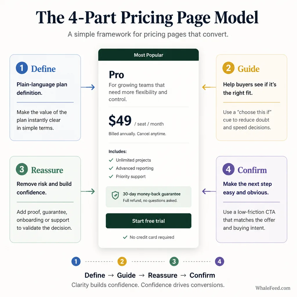
This is the clearest way to think about pricing pages that convert.
Define each plan in plain language
Each plan should have:
- a clear name
- a one-sentence description
- an obvious buyer fit
If a reader cannot tell who a plan is for without reading the feature list, the definition is weak.
Guide the buyer with fit-based cues
Use:
- “choose this if” lines
- buyer-stage cues
- role-based framing
- realistic defaults
A “most popular” badge can help, but only when it explains why. Baymard’s pricing page pairs plan positioning with who the tier is for, which is far more useful than a floating popularity label.[^4]
Reassure with proof and objection handling
This is where guarantees, onboarding details, support information, testimonials, and implementation reassurance belong.
Not buried in footer copy. Not stranded at the top of the page. Close to the choice.
Confirm the decision with a low-friction CTA
The CTA should match the offer.
- Start free works when the product is easy to try.
- Book a walkthrough works when setup complexity is real.
- Enroll now works when the offer is straightforward.
- Request scope often works better than a vague “contact us” for services.
How this changes by business model
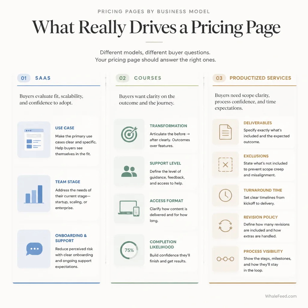
This is where generic pricing advice usually falls apart.
For SaaS: sell use case, team stage, and implementation confidence
SaaS buyers are not just buying software. They are buying workflow change.
So the pricing page should clarify:
- team size or stage
- primary use case
- onboarding burden
- support model
- billing structure
If you show annual pricing, present the effective monthly rate only if the annual total is equally explicit.[^3]
A good SaaS plan card says, in effect: this fits your stage, your workflow, and your implementation reality.
For courses and info products: sell transformation, support, and completion likelihood
Course buyers care less about “features” than creators often assume.
They want to know:
- what result the offer helps them reach
- how much support they get
- whether access is self-paced or live
- how likely they are to finish
A weak course pricing section compares modules.
A stronger one compares learning experience.
For example:
- Self-Study: For experienced operators who want the framework and templates
- Cohort: For people who want deadlines, feedback, and accountability
- Advisory: For teams that want implementation guidance alongside training
That is a better buying lens than “12 modules vs 18 modules.”
For productized services: sell scope clarity, process visibility, and risk control
Service buyers are usually trying to avoid ambiguity.
Your pricing page should make these clear:
- exact deliverables
- what is not included
- turnaround time
- revision policy
- handoff process
- how custom work is handled
If you use custom pricing, explain why. Buyers should understand whether it exists because of volume, complexity, procurement, security, or scope variation. Vague “Contact us” pricing creates suspicion faster than it creates leads.[^4]
Designing pricing pages for AI and answer-driven discovery in 2026
This part is simpler than people make it sound.
AI systems increasingly summarize public pages, so clarity matters more.[^5] That does not mean there is a magic “AI pricing page layout.” It means ambiguous pages are easier to misread.
Use:
- clear plan names
- one-sentence plan definitions
- explicit inclusions and exclusions
- plain billing language
- consistent formatting
Structured data can support that machine readability. Schema.org’s price property and Google’s structured-data documentation both reinforce the value of explicit, machine-readable pricing fields such as price and priceCurrency where appropriate.[^6][^7]
Clarity helps answer engines because it helps extraction. More importantly, it helps hesitant buyers because it reduces interpretation.
Common pricing-page mistakes that quietly hurt conversion
Calling a plan “most popular” without explaining for whom
Popularity is not guidance unless it is tied to fit.
Burying guarantees, onboarding, or support details
These are not side notes. They are often the difference between hesitation and action.
Showing custom pricing too early or too vaguely
Custom pricing works when there is a visible reason for it. Otherwise it reads as friction.
Making the reader work to understand tradeoffs
If buyers have to infer why Plan B costs more, the page is under-explaining the decision.
How to audit your current pricing page
Use this quick test.
Can a qualified buyer choose in under 60 seconds?
This is not a research benchmark. It is a practical heuristic.
If the answer is no, the page probably has too much comparison friction.
Is every visible element helping the decision?
Ask of each block:
- Does this define the offer?
- Does this guide the buyer?
- Does this reassure them?
- Does this confirm the next step?
If not, it is probably filler.
Are the highest-friction objections answered near the CTA?
Not somewhere else on the site. On the page. Near the choice.
Conclusion
The best pricing pages do not win by showing more. They win by making the decision easier.
That usually means less feature noise, more fit-based guidance, clearer tradeoffs, and stronger reassurance exactly where the buyer hesitates. It also means respecting the difference between transparency and overload. You do not need to hide important information. You need to stop leading with information that does not help the decision.
A useful rule to keep: a pricing page should help the right buyer choose with confidence before it tries to explain everything.
FAQ
What should a high-converting pricing page include?
A high-converting pricing page should help buyers decide quickly and confidently. That usually means clear plan names, one-sentence plan definitions, outcome-focused positioning, a short list of decision-relevant differences, proof near the CTA, and answers to objections such as risk, support, onboarding, or switching cost.
What should you hide or de-emphasize on a pricing page?
Do not hide anything important, but compress low-value detail that slows the decision. Long feature matrices, edge-case technical details, and post-purchase questions often work better in FAQs, docs, or expandable sections than in the main pricing grid.
How many pricing plans should a SaaS company show?
There is no universal number, but most SaaS pricing pages work better when the buyer can see a clear path to the right option without sorting through too many permutations. The real test is whether a qualified visitor can identify the best-fit plan in under a minute.
Should a pricing page use a “most popular” label?
Yes, but only if the label adds guidance. “Most popular” works better when it explains who the plan suits or why it is the default choice. Without context, it can feel like generic persuasion rather than useful direction.
How should SaaS pricing pages differ from course pricing pages?
SaaS pricing pages should emphasize use case, team stage, implementation effort, and support. Course pricing pages should emphasize transformation, support level, access terms, and completion support. The principle is the same, but the buyer’s risk and decision criteria are different.
What matters most on a service pricing page?
For productized services, buyers need scope clarity more than feature depth. The page should make deliverables, boundaries, turnaround time, revision policy, process, and next steps easy to understand before the buyer books a call or purchases.
Should I show monthly and annual pricing on the same page?
Usually yes, if both are presented clearly. Show the effective monthly rate if it helps comprehension, but make the actual billing commitment explicit. The goal is to reduce mental effort without creating ambiguity about what the buyer will pay.[^3]
Where should testimonials or proof go on a pricing page?
Place proof near the decision point, not only at the top of the page. A short testimonial, implementation reassurance, guarantee, or usage-based proof line beside the relevant plan card can reduce hesitation at the exact moment the buyer is deciding.[^1]
How do you write a good “choose this if” block?
A good “choose this if” block translates a plan into a buyer situation. Instead of repeating features, explain who the plan fits, what stage they are in, and what problem they are trying to solve. That turns a pricing table into a decision aid.
How can pricing pages be optimized for AI and answer-driven discovery?
Use clear plan names, plain-language plan definitions, explicit inclusions and exclusions, readable billing terms, and structured, machine-readable formatting where appropriate. Clarity helps both human buyers and systems that summarize public web content.[^5][^6][^7]