The 2026 “Answer Asset” Content Stack: Build 1 Topic Into a Calculator + Comparison + Proof Page, Not 10 Blog Posts
Most teams still approach a new topic the same way: publish a blog post, then another from a slightly different angle, then a comparison post, then a “complete guide,” then a case-study-style article that repeats the same ideas. The result is usually a cluster of pages that all explain the topic, but none that truly owns the decision moment.
That approach is getting weaker in AI-first search. When search engines can summarize generic advice directly in the results, summary-style posts are easier to compress. Ahrefs found that AI Overviews were associated with a 34.5% lower CTR for the top-ranking page in one analysis, and later reported sharper declines in newer data; BrightEdge also reported higher impressions alongside lower click-through rates after AI Overviews expanded.[^1][^2] The exact impact varies by query, but the broader pattern is clear: being merely informative is less defensible than it used to be.
The better response is not to stop blogging. It is to build fewer pages that do more. For decision-heavy commercial topics, a tightly linked answer asset stack can create more durable value than 10 loosely differentiated posts. The idea is simple: help the reader calculate something, verify the logic, and compare the right options.
Why 10 blog posts often lose to one well-built answer asset stack
AI-first SERPs reward compression. If your content mostly restates familiar ideas, the interface can often satisfy the searcher before they click. Google’s people-first content guidance points in the same direction by asking whether content offers original information, research, or analysis rather than recycled summaries.[^3]
That is why the usual topic-cluster playbook has started breaking down for commercial topics. Ten articles about pricing strategy, automation ROI, or compliance workflows may expand keyword coverage. But if none helps the visitor estimate their own situation, inspect the assumptions, or choose a path based on context, they are all competing to be a slightly better summary.
The core shift is this: utility, proof, and comparability beat volume. A page that helps someone produce an estimate, understand how it was built, and compare next-step options is harder to replace with a generic summary.
What an answer asset actually is
An answer asset is not just interactive content. It is content designed to reduce uncertainty in a decision.
A blog post mainly explains. An answer asset helps the reader do something: estimate cost, model savings, compare implementation paths, quantify risk, or weigh tradeoffs. That difference matters because it changes the job the page performs.
In practice, the strongest version is a three-page stack:
- Calculator page: gives the immediate answer
- Methodology or proof page: shows how the answer was produced
- Scenario-based comparison page: helps the reader decide what to do with that answer
Each page has a distinct role. This is not a keyword cluster with light rewrites. It is a decision-support system.
The goals are different from a normal blog program:
- Citation potential: the asset contains original, inspectable logic
- Linkability: the methodology or benchmark logic is worth referencing
- Conversion readiness: the user is already working through a real decision
Choose topics where calculation creates real decision value
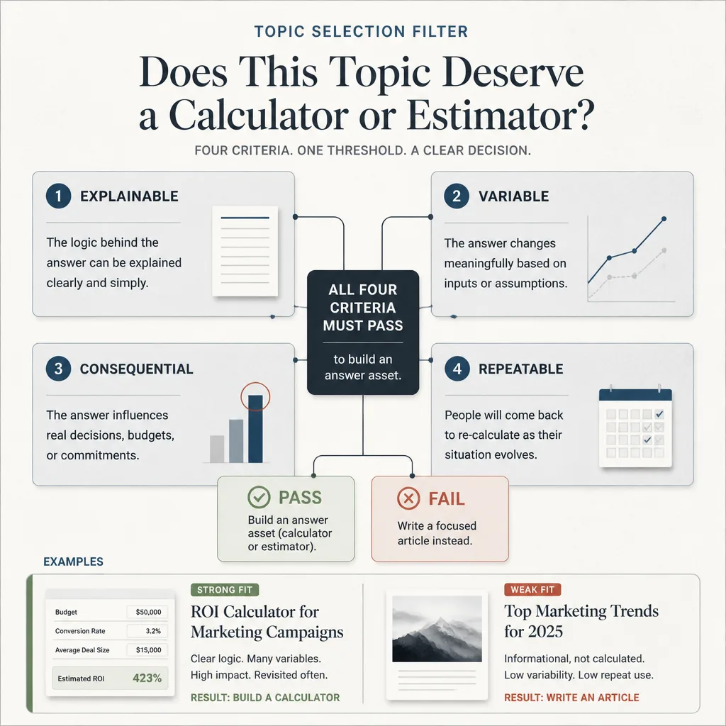
Not every topic needs a calculator. Forcing one into the wrong topic usually lowers trust.
A simple filter works well here: Explainable, Variable, Consequential, Repeatable.
A topic is a strong candidate if:
- the logic can be explained clearly
- the answer changes based on user inputs
- the decision has real stakes
- people make that decision repeatedly
That is why strong candidates tend to be pricing, ROI, time saved, capacity planning, cost of delay, margin modeling, and compliance exposure. Static prose can explain these topics, but it cannot fully answer them because the right answer depends on the reader’s context.
Signals a calculator is genuinely useful
A calculator earns its place when users need to adjust a few meaningful inputs and the result changes what they do next.
Examples:
- A B2B SaaS company builds an automation ROI calculator based on task volume, hourly labor cost, error rate, and implementation cost.
- An agency creates a pricing estimator for retainers versus project work using channel count, reporting complexity, ad spend, and turnaround requirements.
- A compliance software company offers a risk estimator based on workflow volume, industry, audit frequency, and manual-review burden.
These work because the user is not looking for general education. They are trying to model a decision.
Warning signs the calculator will feel forced
If the answer barely changes across inputs, you probably do not need a calculator. If the model relies on invented benchmarks, hidden formulas, or suspiciously precise outputs, you definitely do not need one.
This is where many teams go wrong. They assume a calculator automatically makes content more sophisticated. It does not. A weak calculator exposes weak thinking faster than a strong article does.
If the topic is mostly definitional, trend-driven, or fixed regardless of context, a focused article or lightweight comparison page is often the better asset.
The 3-page stack: build the asset around one topic, not a content cluster
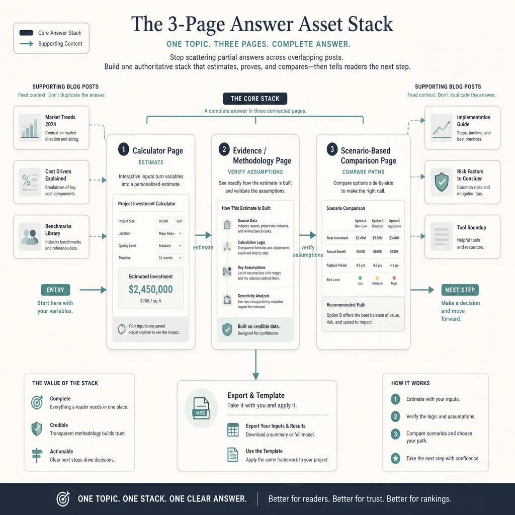
The strength of the stack comes from separating three jobs that readers naturally move through.
Calculator page: instant answer, visible assumptions, next-step outputs
The calculator page should get to value quickly. Ask for the minimum number of inputs needed to produce a credible output. Use sensible defaults. Let users edit assumptions. Show ranges where precision would create false confidence.
For example, an automation ROI calculator might ask for monthly task volume, average handling time, hourly labor cost, and expected automation rate. The output could show estimated hours saved, annual labor savings, payback period, and a low-to-high range based on confidence assumptions.
The page should not feel like a form. It should feel like a fast working session.
Evidence or methodology page: formulas, benchmarks, caveats, update history
This page is where the asset earns trust.
Instead of hiding the model, explain it in plain English. Show the formula, where benchmark numbers came from, which assumptions are fixed, and which ones the user can change. Google’s guidance explicitly emphasizes clear sourcing, evidence, and original analysis as trust-building qualities.[^3]
A good methodology page also includes:
- source notes
- date stamps
- update logs
- benchmark provenance
- edge cases
- known unknowns
That last one matters more than most teams realize. If your estimate is weaker for large enterprises, non-U.S. labor markets, or highly regulated use cases, say so. Trust often improves when you show the limits of the model instead of pretending it is universal.
Scenario-based comparison page: compare options by use case, not just features
The comparison page should not be another generic “Tool A vs Tool B” article.
Its real job is to help the reader interpret the estimate. If the calculator says savings are modest, a lightweight workflow change may be better than a full platform purchase. If the estimate shows high compliance exposure, the cheapest option may no longer be the best fit.
That means the comparison page should be structured around scenarios:
- small team vs. large team
- low volume vs. high volume
- low risk vs. regulated environment
- fast implementation vs. high customization
- DIY operator vs. cross-functional buying committee
This is more credible than a feature checklist because it reflects how decisions are actually made.
How each page should work in practice
The biggest mistake in these builds is overengineering the interface before the model is sound.
Start with the decision, then the formula, then the assumptions. Only after that should you design the page.
On the calculator page, the UX should favor speed. A few fields, immediate outputs, editable assumptions, and visible ranges are usually enough for version one.
On the methodology page, resist the urge to turn it into a math wall. Readers do not need symbolic elegance. They need interpretability. Explain the formula in normal language, note where confidence is high or low, and distinguish hard inputs from directional estimates.
On the comparison page, use scenario framing as the organizing principle. “Best for teams under 10” is more useful than “has feature X.” “Better when implementation speed matters more than customization” is more useful than another vendor matrix.
Internal linking patterns that improve discoverability and context
The safest way to think about internal linking here is not “this will increase AI citations.” That direct claim is hard to prove. The stronger, supportable claim is that good internal linking improves crawlability, page discovery, context, and movement across related tasks.[^4]
The structure should be simple:
- The calculator page links to the methodology page near assumptions and results.
- The methodology page links back to the live calculator and forward to the comparison page.
- The comparison page links back to both the calculator and the proof page where claims depend on assumptions.
Anchor text should clarify purpose, not just repeat keywords. “See full ROI assumptions” is better than “ROI methodology.” “Compare implementation paths by team size” is better than “software comparison page.”
Supporting blog posts can still help, but they should route readers into the stack instead of recreating the same answer. An article on “how to calculate automation ROI” should introduce the concept, then direct readers to the calculator and methodology page rather than becoming a weaker substitute for them.
Trust signals that make the asset quotable
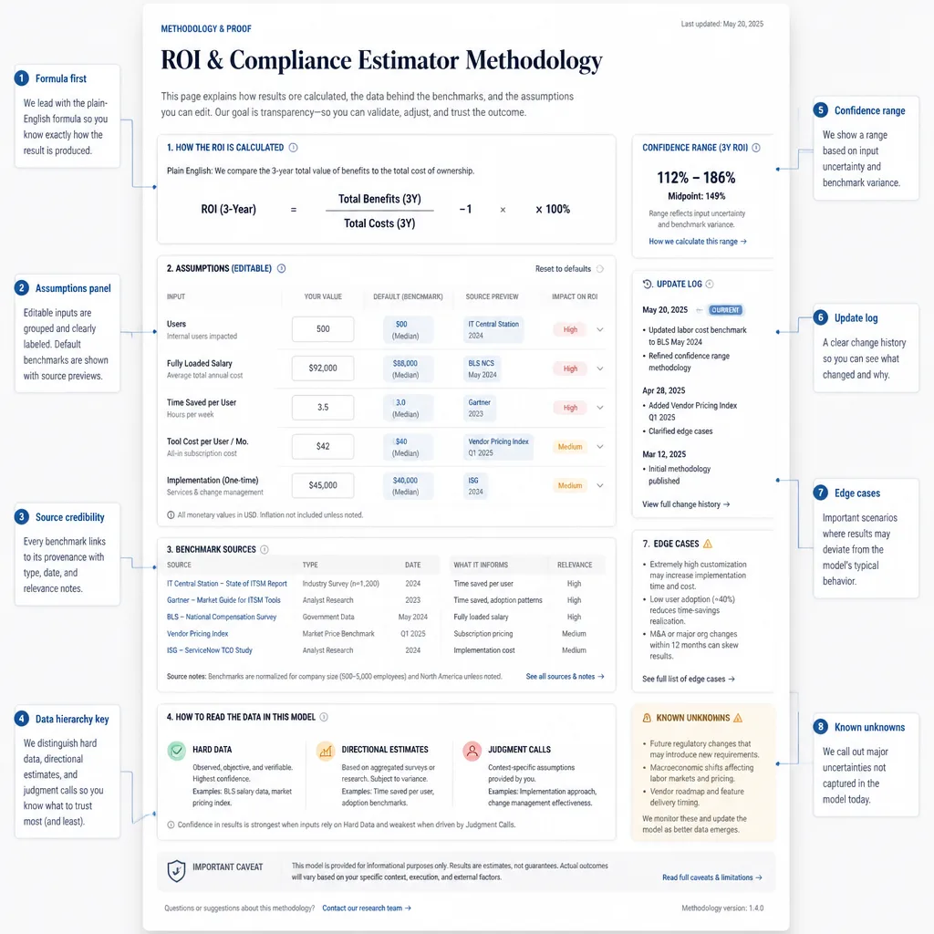
The most valuable trust signal is not polish. It is inspectability.
If someone can see your assumptions, challenge them, and still find the asset useful, you have built something stronger than a polished landing page.
Add an assumptions panel. Publish update logs. Separate hard data from directional estimates. Document edge cases and known unknowns. If a benchmark comes from your internal customer sample rather than an industry-wide study, label it clearly.
This aligns with Google’s broader guidance around original, reliable, people-first content and with its structured data policies, which make clear that markup should reflect real page content rather than substitute for it.[^3][^5]
A practical pattern looks like this:
- Hard data: software price, average setup fee, known regulatory threshold
- Directional estimate: expected time-savings range
- Judgment call: implementation friction multiplier for complex teams
That separation makes the page more trustworthy because readers can see what is measured, what is estimated, and what is interpretive.
Lead capture without ruining the experience
The main answer should stay free.
This is one of the easiest ways to ruin an otherwise strong asset: gate the result, slow the experience, and turn a useful tool into an MQL trap. For most teams, that tradeoff is not worth it.
What usually works better is gating the workflow extension, not the answer itself. Examples include:
- downloadable assumptions sheet
- editable spreadsheet version
- benchmark report
- procurement-ready justification template
- emailed results
- custom scenario review
The best CTA moments happen after the output, after methodology clarification, or after the comparison section. Those are the points where users naturally want the next step.
You can also qualify intent through behavior. Someone who exports results, edits assumptions repeatedly, visits the methodology page, and then opens the comparison page is signaling far more than someone who bounces from a top-of-funnel article.
Operational build process for lean teams
Lean teams can build version one without turning this into a product roadmap.
A practical ownership model looks like this:
- Content/SEO: define topic, page logic, information architecture, and copy
- Analyst or subject matter owner: build formulas and benchmark assumptions
- Designer: simplify inputs and outputs
- Developer or no-code operator: implement calculator behavior
- RevOps or demand gen: map CTA events and lead routing
The build order matters more than the tool choice.
- Define the decision and desired output.
- Build the model in a spreadsheet first.
- Pressure-test assumptions with sales, product, or domain experts.
- Draft the methodology page.
- Build the calculator UI.
- Write the scenario-based comparison page.
- Add light lead capture around high-intent actions.
For maintenance, match the refresh cadence to volatility. Pricing assumptions may need quarterly review. Compliance references may require event-driven updates. Comparison pages should change whenever packaging, implementation reality, or buyer expectations shift.
When this strategy fails
This model is not a universal replacement for articles.
It fails when there are no meaningful variable inputs. It fails when the methodology is weak. It fails when the comparison page is really a disguised sales pitch. And it fails when teams present uncertain outputs with fake precision.
A focused article may still outperform an answer asset when the topic is primarily educational, the answer is mostly fixed, or the team cannot support the model with credible assumptions.
That is the healthy constraint to keep in mind: a weak calculator is worse than no calculator. If you cannot explain the model clearly, support the assumptions honestly, and maintain the page over time, publish a sharp article instead.
Conclusion
The 2026 answer asset content stack works because it helps readers move from question to decision.
That does not mean blog posts are obsolete. It means that for decision-heavy commercial topics, explanation alone is often too easy to compress. A calculator creates utility. A methodology page creates trust. A scenario-based comparison page creates decision fit. Together, they give one topic more depth, more defensibility, and often more business value than 10 lightly differentiated posts.
If you want to test this approach, do not start with your broadest topic. Start with one repeated, high-stakes question your buyers already ask. If the answer depends on inputs, assumptions, and tradeoffs, you may already have the raw material for a much stronger asset.
FAQ
What is an answer asset content stack?
An answer asset content stack is a multi-page content structure built around a single decision-heavy topic. Instead of publishing many overlapping blog posts, you create one calculator or estimator page for the immediate answer, one methodology or proof page for formulas and assumptions, and one scenario-based comparison page to help readers choose the right option.
Why does this work better than publishing 10 blog posts?
For commercial topics with variable inputs, isolated blog posts often repeat summary-level advice. A stack is more useful because it helps people calculate, verify, and compare. That makes it more differentiated, more linkable, and more conversion-ready than a cluster of lightly varied articles.[^1][^2][^3]
When should I build a calculator instead of a standard article?
Build a calculator when the topic has meaningful variable inputs, real stakes attached to the output, and repeated decision demand. Good examples include ROI, pricing, time saved, compliance exposure, capacity planning, and cost of delay. If the answer is mostly fixed regardless of user input, a strong article may be the better format.
What should be included on the methodology or proof page?
The methodology page should explain how the calculator works in plain English. Include formulas, benchmark sources, editable assumptions, date stamps, update history, caveats, edge cases, and a clear distinction between hard data, directional estimates, and judgment-based inputs.[^3]
How should the comparison page be structured?
Use scenarios, not just feature lists. A strong comparison page shows which option fits different contexts such as team size, budget, workflow complexity, implementation maturity, or compliance risk. Its job is to help readers interpret the calculator result and choose the best-fit path.
Does internal linking between these pages improve AI citations?
It is safer to treat that as an informed inference rather than a proven direct effect. Strong internal linking clearly helps crawlability, discovery, contextual understanding, and movement between estimate, proof, and comparison pages. Those qualities may support citation likelihood, but they do not guarantee it.[^4]
What trust signals make an answer asset more credible?
The biggest trust signals are transparent assumptions, source notes, benchmark provenance, update logs, date stamps, known unknowns, and clear caveats. A calculator without visible assumptions can feel gimmicky. A calculator with inspectable logic feels more trustworthy and more useful.[^3][^5]
Should the calculator results be gated behind a form?
Usually no. The main answer should remain free and immediately usable. Better lead-capture options include downloadable assumptions sheets, spreadsheet exports, benchmark packs, emailed results, editable templates, or custom scenario reviews offered after the result is shown.
What are the best topics for an answer asset stack?
High-fit topics include ROI calculators, pricing estimators, labor-time savings tools, budget forecasting, margin modeling, compliance-risk estimators, headcount planning, and cost-of-delay analysis. These topics benefit from user-specific inputs and carry real decision consequences.
When does this strategy fail?
It usually fails when there are no meaningful variable inputs, the methodology is weak, the benchmarks are invented, the output pretends to be more precise than it is, the comparison page reads like a sales pitch, or the asset is over-gated and hard to use.
How should teams measure success for this stack?
Measure it against both visibility and business outcomes. Useful metrics include qualified organic traffic, assisted conversions, export or save actions, demo requests, backlinks, branded search lift, sales-team usage, and the percentage of visitors who move from calculator to proof page to comparison page.
Can lean teams build this without custom development?
Often yes for version one. Many teams can prototype the model in a spreadsheet, use lightweight form or calculator tools for the first release, and publish a methodology page with transparent assumptions. Custom development becomes more important when the tool needs richer UX, saved results, integrations, or dynamic personalization.